WeBeat it.
Move with purpose and Beat your goals.

What is WeBeat it?
WeBeat It is a fitness app that motivates users to reach their sports goals through personalized challenges in activities like running, walking, and cycling. It offers progress tracking, device connectivity, and the option to place bets on challenges for extra motivation. Users can also connect with others, encouraging a supportive and competitive community to keep each other inspired and engaged.
The solution
We designed an intuitive interface that allows users to easily join personalized challenges, track their progress, and stay motivated.
The app integrates with various devices for accurate monitoring and includes a betting feature for extra engagement. A community element was added to connect users, encouraging them to share progress, support each other, and stay motivated together. The design focuses on simplicity, engagement, and user motivation to help users achieve their fitness goals.
The challenge
The client came up with the idea of creating a fitness app that not only helps users reach their sports goals but also motivates them through personalized challenges, progress tracking, and betting on challenges. The vision was to offer a platform where users could improve their performance in activities like running, walking and cycling, connecting their devices for detailed tracking while making training more exciting and competitive.
The design process
01 Exploration
02 Ideation
03 Design
04 Test
05 Develop
Exploration
01
Evaluation
Before the development of WeBeat It, the client conducted an initial user evaluation to validate the concept of the app and identify user needs. Through interviews and surveys, they explored whether potential users would engage with an app of this nature and what features they would find most valuable. This evaluation provided insights into users’ goals, frustrations, and expectations related to fitness and activity tracking.

Research
To understand the app landscape and identify opportunities for WeBeat It, we conducted a thorough competitor analysis. We explored direct and indirect competitors, examining their strengths, weaknesses, and unique features. This research provided us with valuable insights into user expectations, industry standards, and potential differentiators for WeBeat It.


Ideation
02

Userflow
Wireframes
Before designing the user flow, we defined the scope to determine the sections and features required. With a clear structure in mind, we then created the user flow to map out each interaction, ensuring a seamless experience that guides users naturally through the app’s key sections. This foundation helped streamline the design process and align it with user needs and project goals.


The design process
03
For this project, we designed a custom logo alongside the app to maintain brand consistency.
We also created a comprehensive design system, including colors, typography, iconography, buttons, paddings, and other components.

App Icon
Colors
#F402B4
#00CCF4
#26F2AE
#2116C7
#090F3A
#242F66
#FFFFFF
#E3E5E8

Font
Icons
App design
Onboarding
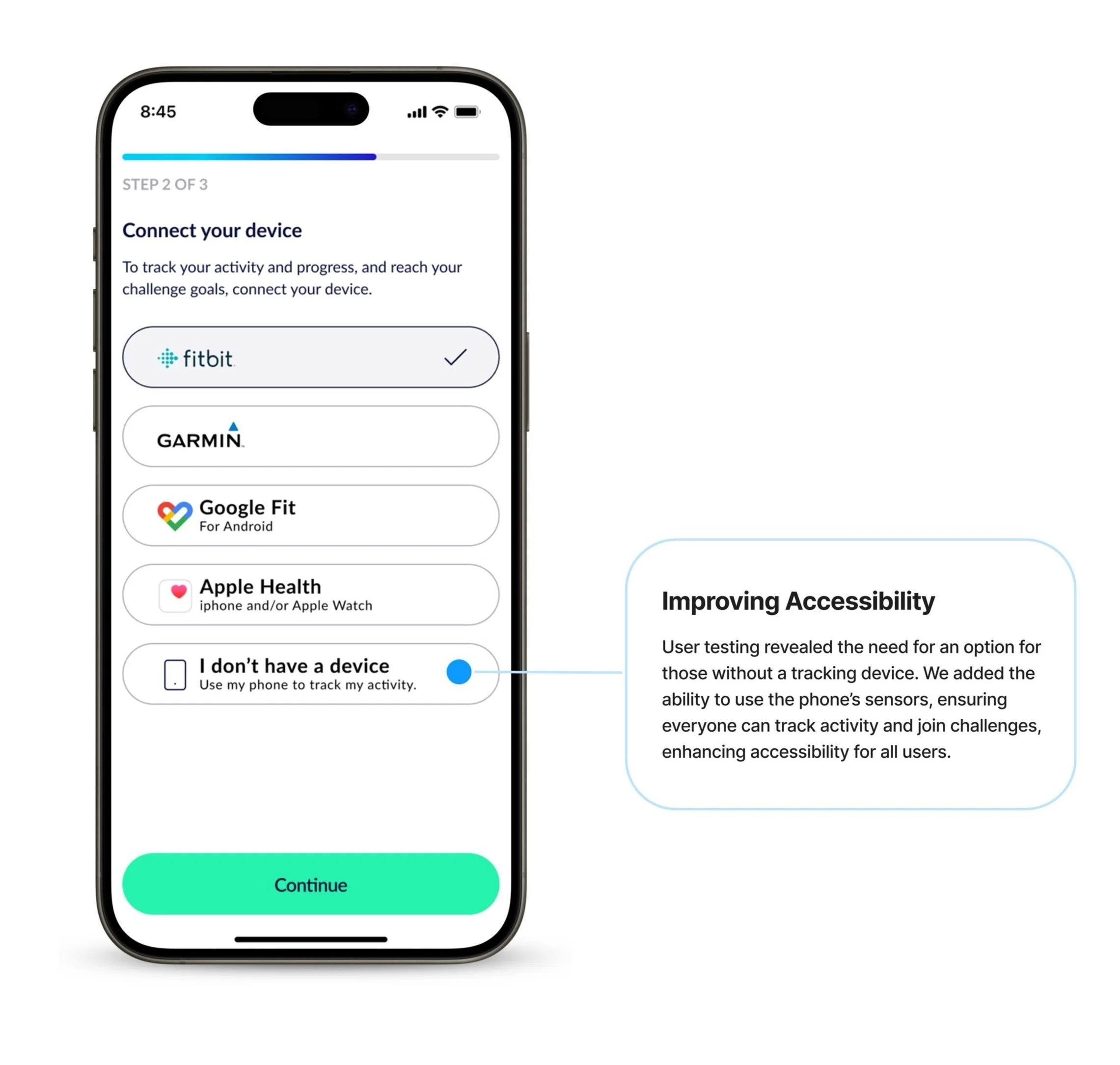
The onboarding was designed to quickly introduce users to the app’s features and set them up for success. Through a clear and interactive flow, users can connect their devices and set goals, guiding them toward joining their first challenge and starting their fitness journey with confidence.


Features
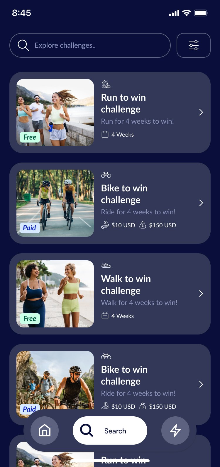
Users can track progress, connect their devices, and monitor other participants' performance to stay motivated. The app also offers the option to join paid challenges, adding an extra layer of excitement with bets and prize pots, fostering both competition and community.


Test
04
User testing
We conducted user testing with 5 participants who interacted with the app prototype. Their feedback provided valuable insights into usability, navigation, and overall functionality.
This process helped us identify areas for improvement, ensuring the app meets user needs and delivers a seamless experience. The results guided key adjustments in the design to enhance clarity and engagement.


Results
After conducting user tests, we organized insights into individual boards for each participant. Each board captured feedback for the specific flows presented in the prototype, highlighting pain points, successes, and user suggestions. Once all interviews were complete, we consolidated the information into a larger board to identify
patterns and recurring themes. This process allowed us to clearly understand the most common pain points, strengths, and improvement areas, guiding us in making targeted design enhancements.


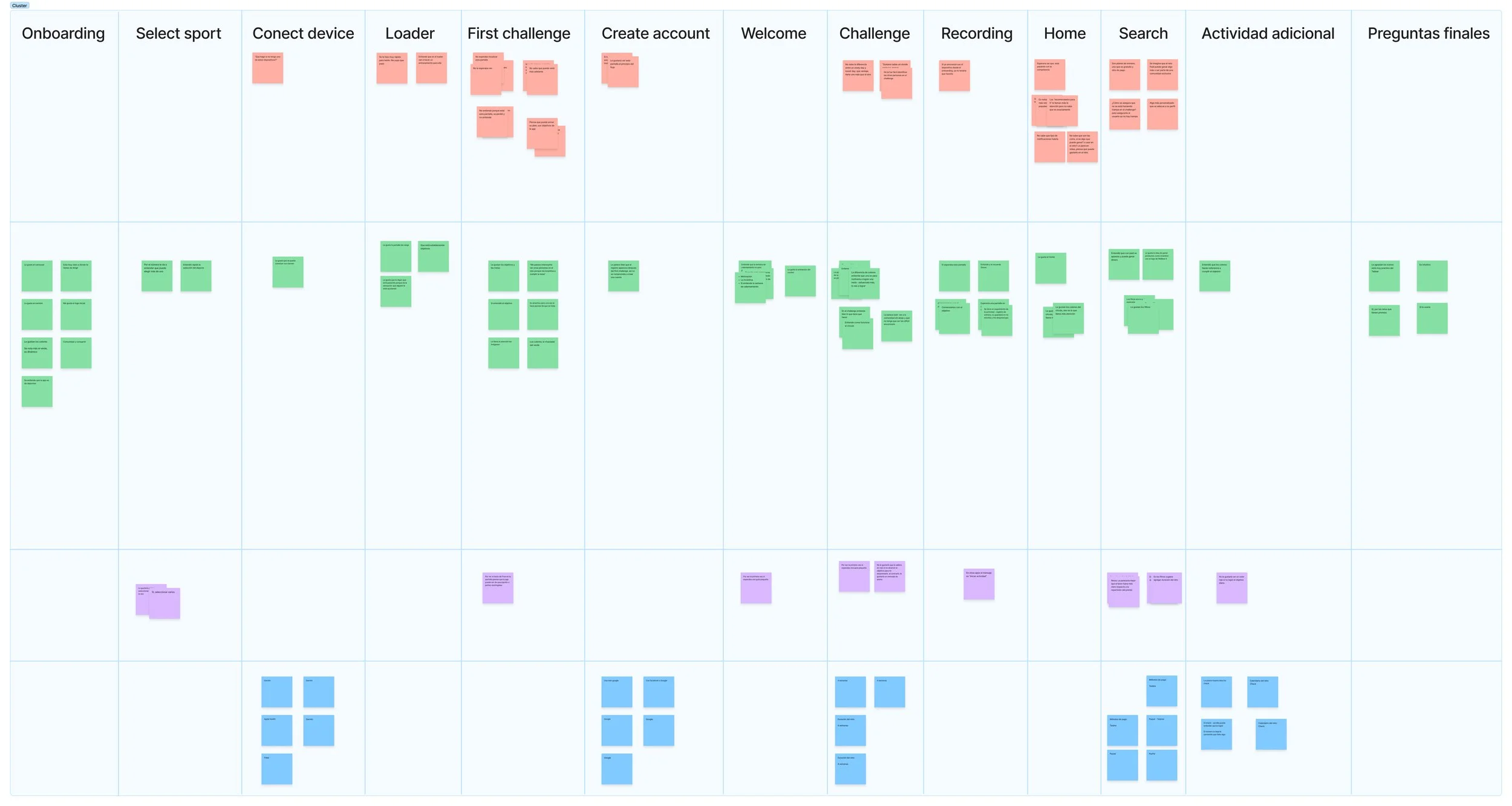
Improvments
Based on user feedback, we made several enhancements to the app’s flow and design. One key highlight was that all participants agreed the app felt intuitive, which reaffirmed the strength of its usability.
Here are some of the key improvements implemented to further refine the user experience:


Handoff to Development
05
We provided the development team with a detailed app map, including user flows and screens. This was supported by user stories and iteration examples to guide the implementation of the design, ensuring a smooth transition from design to development. Additionally, we included the dark mode version of the app to offer users a choice of themes, enhancing the overall user experience.


Dark mode


Project Reflection
This project was a highly rewarding experience, as it allowed me to work on a comprehensive design solution from start to finish. Not only did I design the app, but I also had the opportunity to create the logo, which added an extra layer of creativity and consistency to the brand. I enjoyed the process of refining user flows, implementing improvements based on real user feedback. Overall, this project was a great challenge, and it was fulfilling to contribute to a product that motivates users to achieve their fitness goals while delivering an intuitive and engaging experience.